Skip to main content
facebook
pinterest
youtube
instagram
227 E 57th St. NYC
MON – FRI : 10AM - 7PM (SUN BY APPOINTMENT)
212-308-8255
Hit enter to search or ESC to close
Close Search
Menu
HOME
ABOUT US
PROJECTS
GALLERY
TEXTURES
VENETIAN PLASTER
TADELAKT PLASTER
DESIGN SERVICES
CLIENTS
CONTACT
HOME
ABOUT US
PROJECTS
GALLERY
TEXTURES
VENETIAN PLASTER
TADELAKT PLASTER
DESIGN SERVICES
CLIENTS
CONTACT
Home
»
Decorfin Portfolio
DECORFIN PORTFOLIO
VENETIAN PLASTER PORTFOLIO
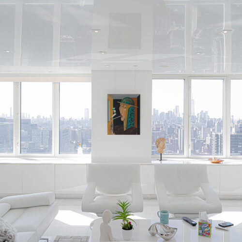
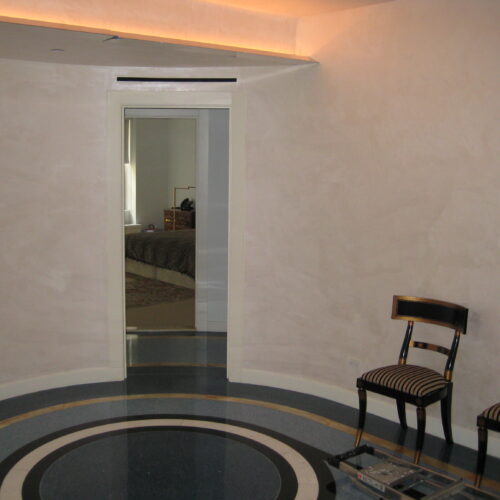
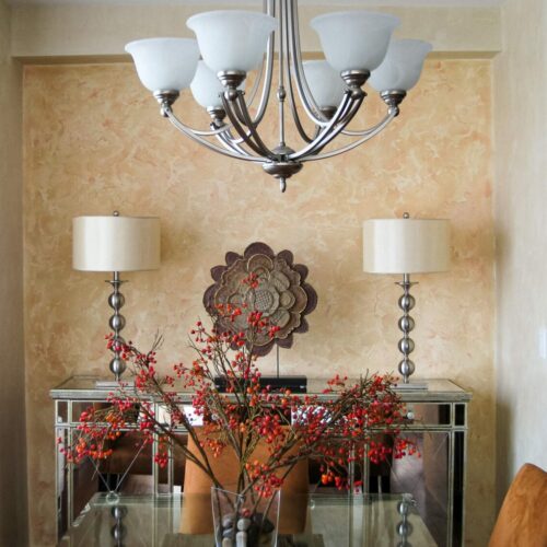
330 East 38th street
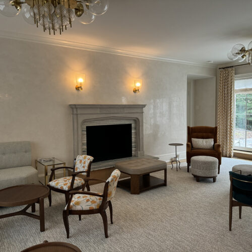
Armonk Private Residence X Lori Margolis
Old Westbury X Michelle Gerson
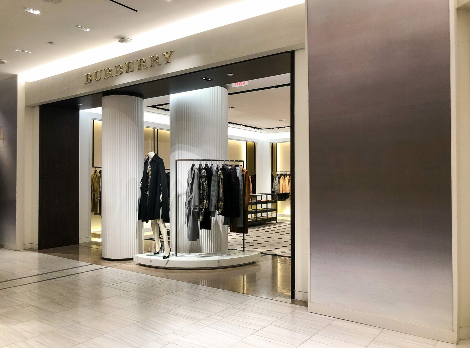
Saks Fifth Av New York Flagship X Marco Opicci
Olympia X Rushda Hakim
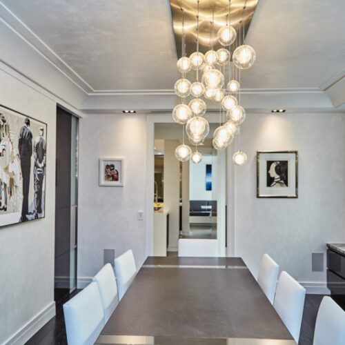
Triplex Sullivan street
164 W 74th st
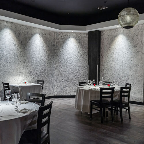
Mike’s Bistro Restaurant
Private house X Mendelson group
Private House New Jersey
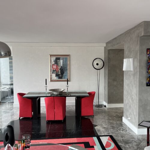
Versace House
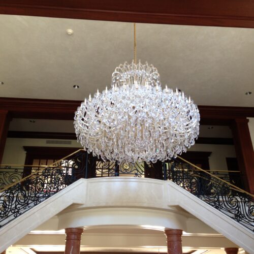
860 United Nations Plaza Building
Mansion in Connecticut
Duplex Penthouse Park Avenue X Roric Tobin designs
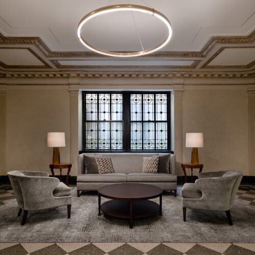
Lobby Park Avenue X Liz Romano
Park Avenue
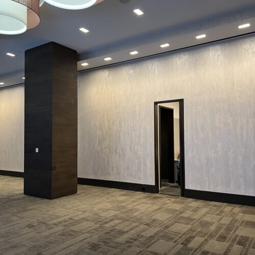
Party Room 50 Riverside Boulevard
30 Park Place Building